My first attempts at photography in 1968 (see Part One) were in black and white, naturally enough. Colour photography was a bit of specialist pastime in those days and the materials were of rather poor quality. I had the use of the school darkroom and experienced the excitement of watching my prints slowly becoming visible in a tray of developer. I have always felt that b&w was a suitable medium for railway photography in the last days of steam. There was nothing glamourous at all in the subject matter and arguably very little that colour could add. The school darkroom was demolished very soon after I started using it, however, and thus ended my first stab at photography.

My father continued togive me his old cameras as he upgraded to something more up-to-date. So I also became a Praktica user. By the early 1970’s, colour materials must have become easier to get hold of, and develop-and-print packages more affordable, because I never went into a darkroom again. It was colour negative all the way for me. The film went to Boots, or, more likely, Max Spielmann for p&p. At that time I was just messing around with cameras really, just having fun. I can remember a game I played with another student where we pursued each other around Nottingham city centre, each one trying to take photographs of the other without being seen. Although I gradually took my photography more seriously it never occurred to me to use anything but colour. My philosophy was simple : we live in a colour world, so why photograph it in b&w? Most serious photographers, on the other hand, would have been using monochrome. One exception was Ernst Haas, whose crowning achievement (first published in 1971) was the Creation, produced entirely in colour.

But, to coin a phrase, I digress. Most of the photographers that have inspired me (Ernst Haas, Paul Wakefield, Joe Cornish, Chris Gomersall, and others) have worked entirely in colour, while one in particular only did so in her later years. I refer to Fay Godwin, who I have already mentioned in this blog a number of times – here, for example. Her best known and most influential work was done in monochrome in the 1970’s and 80’s. I began to wonder if its particular power could have resulted from the use of monochrome. Perhaps the messages she was trying to convey came over more clearly without a sheen of colour to distract the mind/eye? So I began to think about doing b&w conversions of my own originals. Just for starters, I decided to convert some images from my recent visit to the Ffestiniog Railway at Boston Lodge. As I mentioned above I have always felt that b&w was ideal for steam railway photography. Only those aged 60 or more will personally remember the last days of steam and the photographs from the era, which were inevitably monochrome. It could be that there is an element of nostalgia involved but I suspect it is more than that.

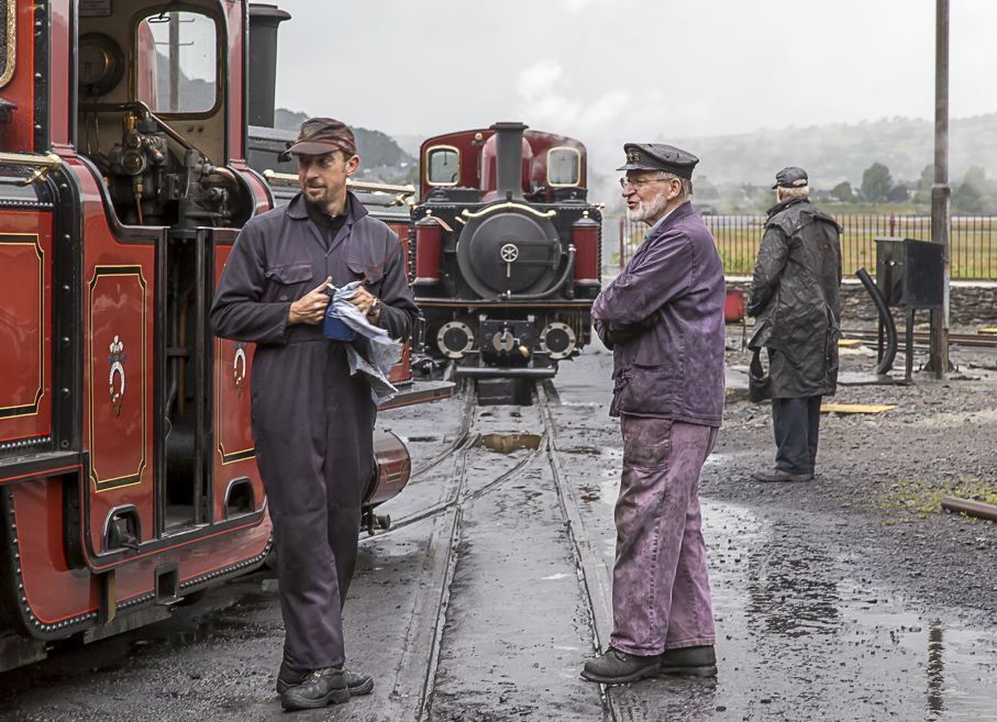
Last weekend I was up in north Wales and frustrated yet again by some dismal (but very typical) August weather. On a still and humid Sunday morning there were patches of mid-level cloud wrapping themselves around hilltops and mountain-sides. The landscape photographer might take some spectacular images if the sun broke through a broken layer of high level cloud. The latter looked thinner at the coast so I headed down to the Cob at Porthmadog; the view to Snowdon from its southern end is an iconic one. Long distance visibility from there was limited, unfortunately, but just a few meters away in the other direction lay Boston Lodge, and it looked stunning! As the railwaymen prepared the engines for the new day’s work I had another short session photographing them “contre-jour” before the sun disappeared completely.
To follow Tales from Wild Wales, scroll to the bottom and click Follow.